 Alternatively titled: On Covering Your Ass
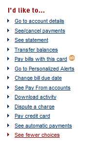
Check out that picture on the right. That’s from my credit card’s website. My favorite part is the red link on the bottom that proclaims, “See fewer choices.” You know what that option is? That’s a designer or usability person saying to the team, “Hello team, we have heard from users that there are too many choices on the screen.” Then the usability/design person recommends that we prioritize the options on the screen and progressively disclose them so that only the most used choices will be shown up front.
Then someone on the team shouts, “But we can’t remove links that are already there! Users will haaaaate that! Maybe we can just put an option to ‘See fewer choices,’ that way we can make everyone happy!” The designer/usability person shakes their head in disapproval. What the team did in is take the easy way out. Rather than analyzing user needs on a deeper level and getting an understanding about what choices are valuable at each point in time, they simply put a link to “See fewer choices.”
Lazy, lazy, lazy.
Building usable tools is about more than giving the user exactly what they ask for. It’s about designing for needs…needs that the users themselves can sometimes be blind to. It’s about thinking deeply about problems, and crafting creative solutions based on data (that has been gathered from the real world of the users).
Let’s work a little harder to make better software, shall we? I shall. Who’s with me?
Leave a Reply