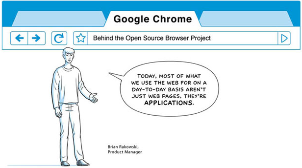
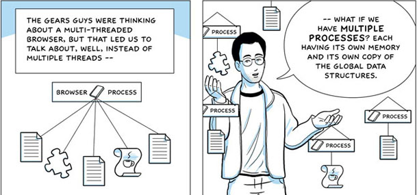
So the big news on the internets today is Google’s new browser: Chrome. It’s only available for Windows as of today, and since I’m on a Mac I haven’t been able to play with it yet. But that’s ok, because Google hasn’t completely left me out of the loop. I have access to the comic interpretation of their engineering decisions.

Comics have been a topic of discussion in the Interaction Design Community for a while now. With Scott McCloud providing the art for Google’s message, they really couldn’t go wrong. McCloud has quite literally written the book(s) on creating effective comics. (Of course, you can create your own design comics too, thanks to projects like Martin Hardee’s Design Comics.)
One thing that I’d like to applaud Google for with this comic is their use of actual Googlers as the narrators of the story. Naming names like this gives credit to the actual thinkers behind the work. All too often in the business world today, we hide individuals behind a big corporate brand. In this example, these Googlers will feel real ownership and responsibility for their product, and they’ll be motivated to continue working on the project even if (and when) they leave Google. Of course, I’d also like to call out the fact that no User Experience team members were named in this document, even in the section titled “Search and the User Experience.” This is strange, and I hope there was a User Experience team dedicated to this project.
And another thing Google did well here was in not trying to over-engineer their explanations of highly technical processes. They simplified their message down to bare essentials, and I felt enlightened after reading this document. Most technical documentation talks down to people, assuming that all the basics are already understood. Google removed some barriers to entry by explaining their new technologies in a way that almost anyone with a little technical know-how can understand. This is something almost every other open source project out there fails at. Technical documentation is far more than simply documentation…it’s an implicit invitation to take part in the experience.

At the end of the day, I’m really impressed at the quality of this documentation. I actually read the entire thing, which is much more than I can say about the technical documentation for any other software I use. Who knew that I could find the difference between multiple threads and multiple processes interesting?
Well done, Google. Now I just have to find a Windows computer…ugh. I swore off those things months ago…
Leave a Reply