Tonight is a big night here in the US. It’s election night, one of my favorite nights of the year. Well, it doesn’t really happen every year, but still. I like it. Ok? Alright.
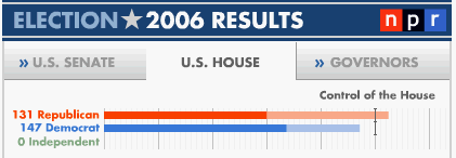
This evening I was hanging out at NPR.org checking out the stats. One of the reasons I enjoy election nights is the interesting ways that the news organizations use information graphics. Check out this nifty little image:

I really like the use of the “finish line” for control of the house. This image is instantly understandable. The big story all over the news right now is about how close this election will be with respect to Democrats gaining control of the House & Senate, and this image simply explains how that is playing out. Kudos to NPR.
Now let’s check out MSNBC‘s little visual tool:

This visualization definitely has its merits. The “speedometer” metaphor is a good one, but seems to connote a feeling of “slow” for Democrats and “fast” for Republicans. Still, it makes visual sense. One complaint I have is that the text is just too small, but that’s nitpicky as well. The biggest problem with this graphic is that it packs so much information into a small space. It’s hard to take away any substantial meaning from this graphic at a glance. One speedometer would have said so much more than the combination of two.
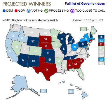
Finally, let’s have a look at a graphic from CNN.com:

What’s with those colors? I count 5 separate colors, each of which I suppose is meant to mean one of 3 things:
- Blue = Democrat
- Red = Republican
- Grey = No election in this term
I have no idea what the in-between colors are for. That horrible neon blue means nothing to me…and neither does the green…despite the one-liner instruction. And to top it off, there is no key (no, that bar with graphics at the top does not count as a key). Come on, CNN, you can do better with your InfoGraphics (in fact, you have to, it’s one of your biggest nights of the year).
So now we’ve seen some good, bad, and ugly of Election InfoGraphic Design. You can weigh in with your thoughts in the comments below. Check it out, my blog is a mini democracy. Cool beans.
Leave a Reply